Posted 2025-11-25 | Back to 2025 archive
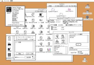
Big fan of this KanjiTalk 6 aesthetic. The brutalist sparseness of System 6 before they added the little 3D touches and proper color icons, and the uncomfortably oversized fonts used to fit the detail needed to show readable Kanji causing everything to feel a bit cramped and misaligned.